Data Types
This reading will teach you the tools and techniques used to organize, visualize,... Read More

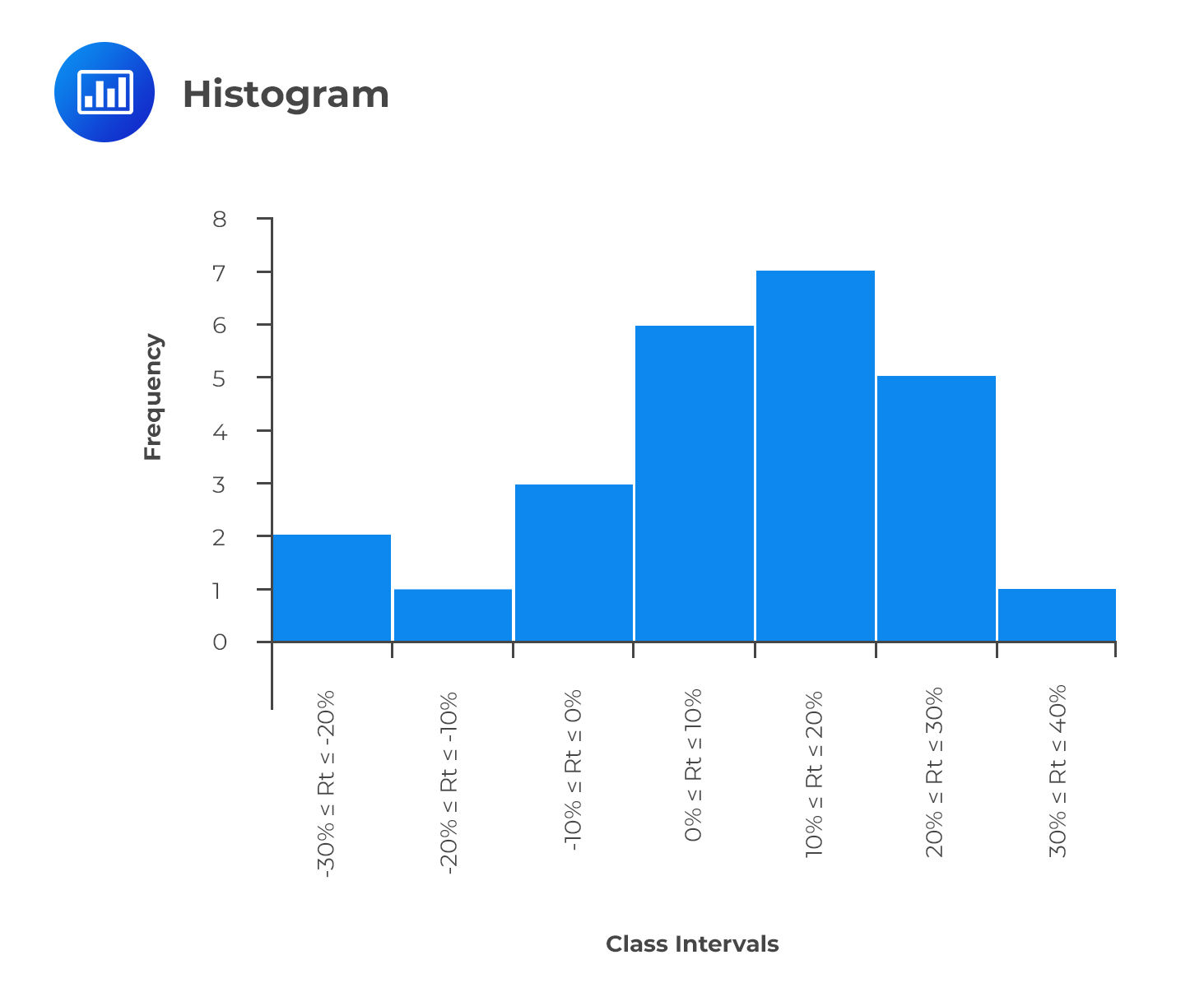
A histogram shows the distribution of numerical data in the form of a graph. However, it is very similar to a bar chart, a histogram groups data into intervals. To construct a histogram, you need to establish all the intervals of data, commonly known as bins. The intervals should capture all the data points and also be non-overlapping.
The intervals appear on the horizontal axis, while the absolute frequencies appear on the vertical axis. For a histogram with equal intervals in size, a rectangle should be erected over the interval, with its height being proportional to the absolute frequency. If intervals are unequal in size, the erected rectangle has an area proportional to the absolute frequency of that particular interval. We would have the vertical axis labeled as ‘density’ instead of frequency in such a case. There should be no space between bars to indicate that the intervals are continuous.
Consider the previous example of the returns offered by a stock. To bring you up to speed, these were the intervals and the corresponding frequencies:
$$ \begin{array}{c|c} \textbf{Interval} & \textbf{Tally} & \textbf{Frequency} \\ \hline -30\% \leq R_t \leq -20\% & \text{II} & \text{2} \\ -20\% \leq R_t \leq -10\% & \text{I} & \text{1} \\ -10\% \leq R_t \leq 0\% & \text{III} & \text{3} \\ 0\% \leq R_t \leq 10\% & \text{IIIIII} & \text{6} \\ 10\% \leq R_t \leq 20\% & \text{IIIIIII} & \text{7} \\ 20\% \leq R_t \leq 30\% & \text{IIIII} & \text{5} \\ 30\% \leq R_t \leq 40\% & \text{I} & \text{1} \\ \textbf{Total} & \text{} & \textbf{25} \\ \end{array} $$
It is also used to represent the distribution of data graphically. However, it has a major difference when compared to the histogram. Instead of having the class intervals on the horizontal axis clearly showing their upper and lower limits, a frequency polygon uses the midpoints of the class intervals.
$$ \text{Midpoint of a class interval} =\text {Lower limit} + \cfrac { (\text{Upper limit} – \text{Lower limit}) }{ 2 } $$
The vertical axis features the absolute frequencies, which are then joined using straight lines and markers.
Going back to the stock return data, we could come up with a frequency polygon.
To come up with the midpoints, we use the formula above. As an example, the midpoint of the interval -30% ≤ Rt ≤ -20% is:
$$ \text{Midpoint} = -30 + \cfrac {(-20 – – 30)}{2} = -25 $$
We can calculate the midpoints for the other intervals in a similar manner. The final frequency polygon should look like this:
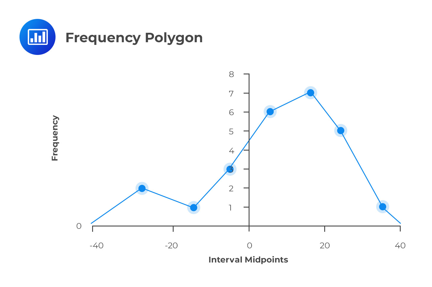
The frequency polygon is important because it shows the shape of a distribution of data. It can also be very useful when comparing two sets of data side-by-side.
Note: The endpoints touch the X-axis. The vertical scale can also be positioned at the left margin.
Access CFA Level I quantitative methods study notes, practice questions, mock exams, and video lessons to strengthen your understanding of histograms, frequency polygons, and data visualization.


Get Ahead on Your Study Prep This Cyber Monday! Save 35% on all CFA® and FRM® Unlimited Packages. Use code CYBERMONDAY at checkout. Offer ends Dec 1st.