


Application of Conditional Expectation ...
[vsw id=”hu47ZbsskEw” source=”youtube” width=”611″ height=”344″ autoplay=”no”] The conditional expectation, in the context of... Read More

Data visualization refers to the presentation of data in a pictorial or graphical format using different graphs such as histograms, polygons, line charts, bar charts, etc.
A histogram is a graphical representation of the data contained in a frequency distribution. It is a bar chart of data that groups data into intervals. The intervals should capture all the data points, and, in addition, the intervals should not overlap. A histogram is constructed by plotting intervals on the horizontal axis and the absolute frequencies on the vertical axis.
If a histogram has equal size intervals, a rectangle should be erected over it, with its height being proportional to the absolute frequency. If intervals are of unequal sizes, then the erected rectangle has an area proportional to the absolute frequency of that particular interval. In such a case, we would have the vertical axis labeled as ‘density’ instead of frequency. There should be no space between bars to indicate that the intervals are continuous.
Consider the previous example of the returns offered by a stock. To bring you up to speed, these were the intervals and the corresponding frequencies:
$$
\begin{array}{c|c|c}
\text { Interval } & \text { Tally } & \text { Frequency } \\
\hline-30 \% \leq \mathrm{R}_{\mathrm{t}} \leq-20 \% & \text { II } & 2 \\
-20 \% \leq \mathrm{R}_{\mathrm{t}} \leq-10 \% & \text { I } & 1 \\
-10 \% \leq \mathrm{R}_{t} \leq 0 \% & \text { III } & 3 \\
0 \% \leq \mathrm{R}_{t} \leq 10 \% & \text { IIIII } & 6 \\
10 \% \leq \mathrm{R}_{t} \leq 20 \% & \text { IIIIII } & 7 \\
20 \% \leq \mathrm{R}_{t} \leq 30 \% & \text { IIII } & 5\\
30 \% \leq \mathrm{R}_{t} \leq 40 \% & \text { I } & 1 \\ \hline
\text { Total } & & 25 & =25 / 25=100 \%
\end{array}
$$
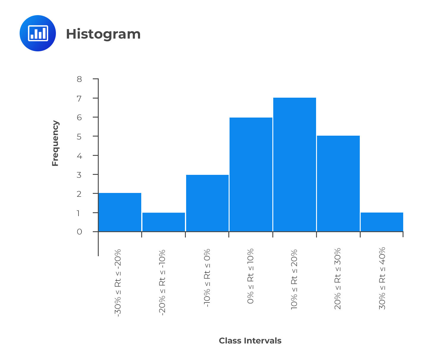
As mentioned earlier, histograms can also be created with relative frequencies—the choice of using either absolute or relative frequency depends on the question being answered. An absolute frequency histogram best answers the question of how many items are in each bin. In contrast, a relative frequency histogram gives the proportion or percentage of the total observations in each bin.
A frequency polygon is used to represent the distribution of data graphically. However, there is a major difference between a frequency polygon and a histogram. Instead of having the class intervals on the horizontal axis clearly showing their upper and lower limits, a frequency polygon uses the midpoints of the class intervals where:
$$\text{Midpoint of a class interval}= \text{Lower limit}+\frac{\text{Upper limit-Lower limit}}{2}$$
The vertical axis features the absolute frequencies, which are then joined using straight lines and markers.
Going back to the stock return data, we could come up with a frequency polygon. To come up with the midpoints, we use the formula above. As an example, the midpoint of the interval -30% ≤ Rt ≤ -20% is:
$$ \text{Midpoint} = -30 + \cfrac {(-20 – – 30)}{2} = -25 $$
We can calculate the midpoints for the other intervals in a similar manner. The final frequency polygon should look like this:
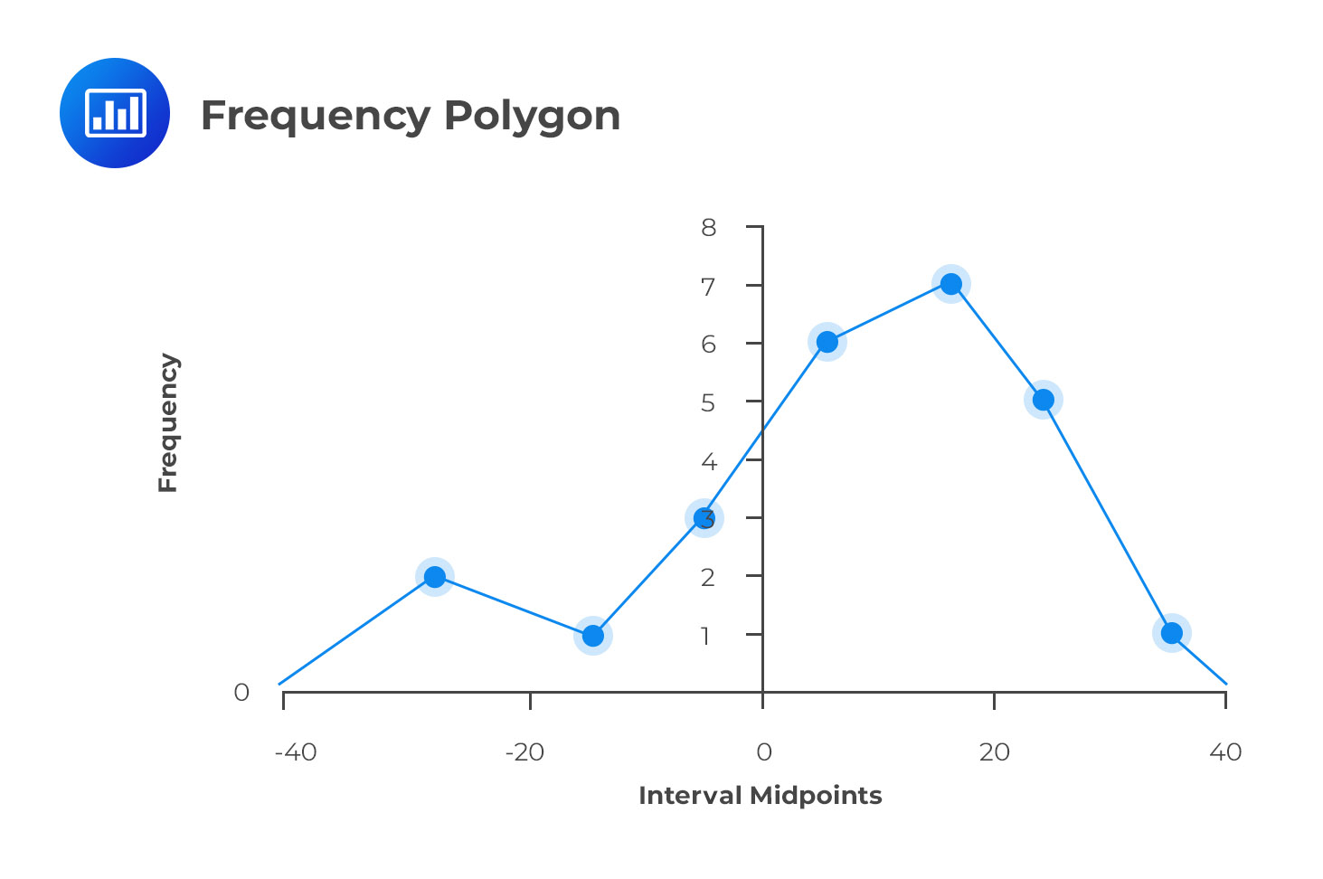
The frequency polygon is important because it shows the shape of a distribution of data. It can also be very useful when comparing two sets of data side-by-side. Note that the endpoints touch the X-axis. The vertical scale can also be positioned at the left margin.
A cumulative frequency distribution graph can plot the cumulative frequency or relative frequency against the upper interval limit. The cumulative frequency distribution allows us to see how many or what percentage of the observations lie below a certain value. The figure below is an example of a cumulative frequency distribution.
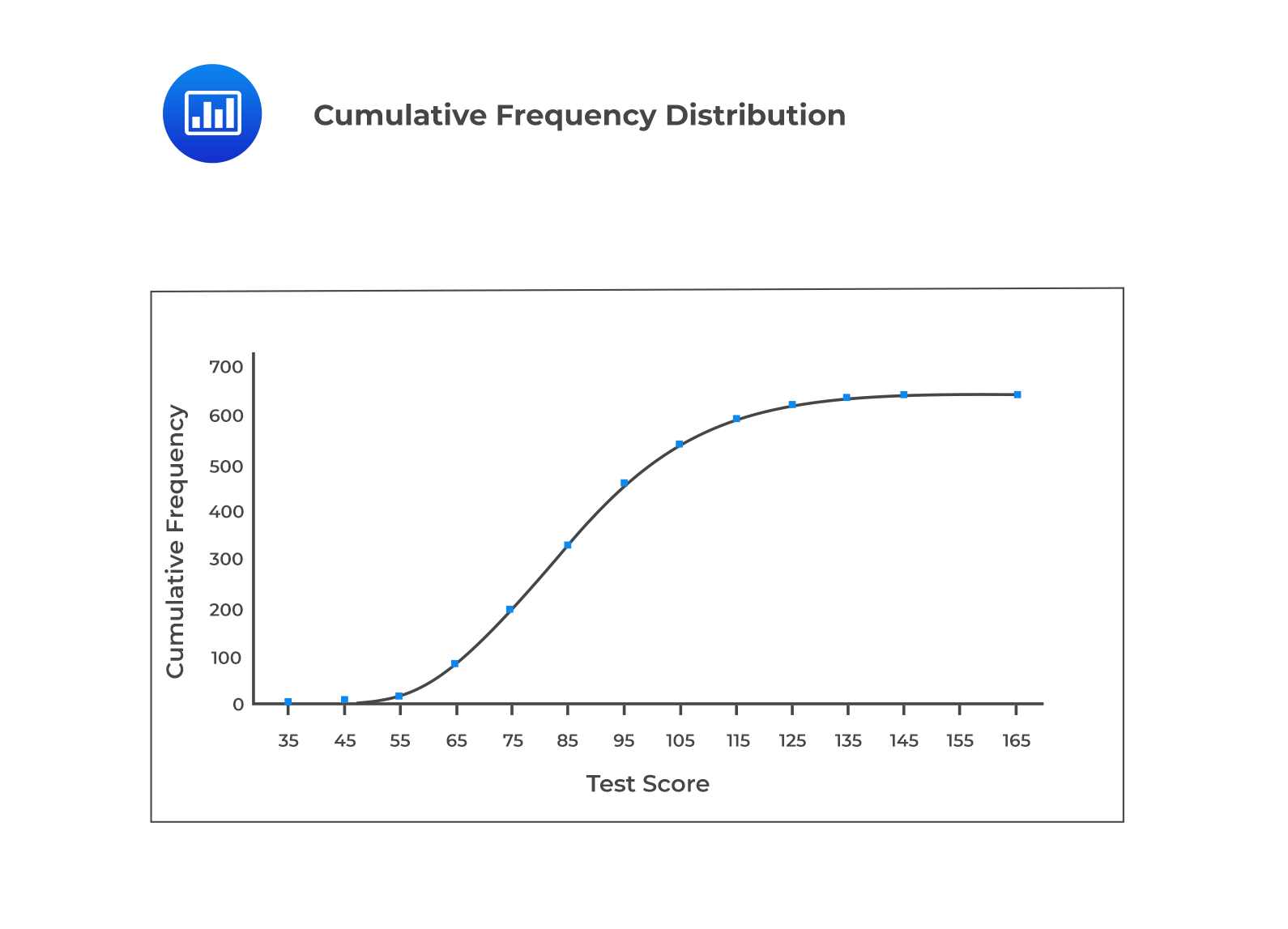
As we move from one interval to the next, The change in the cumulative relative frequency represents the interval’s relative frequency. A steep slope of the cumulative frequency distribution indicates that the frequencies are large. It is pertinent to note that the slope of the cumulative absolute distribution at any particular interval is proportional to the number of observations in that interval.
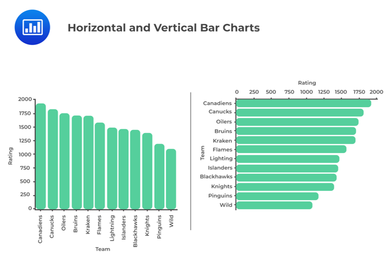
A bar chart is used to plot the frequency distribution of category-based data. In a bar chart, each bar represents a distinct category, while the height of a bar is proportional to the frequency of the corresponding category. Bar charts can be vertical or horizontal.
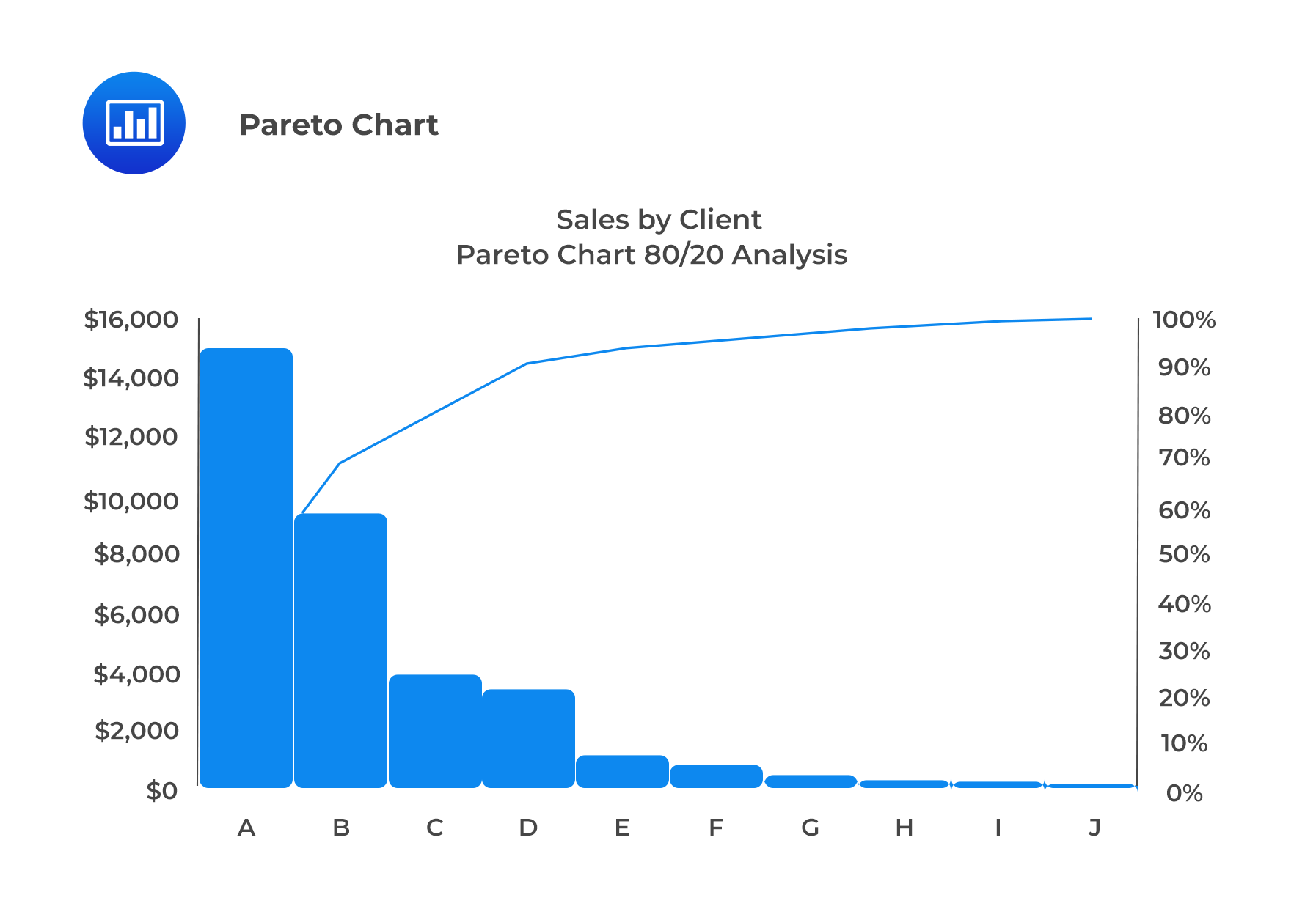
A bar chart in which categories are ordered by frequency in descending order and has a line displaying cumulative relative frequency is known as a Pareto Chart. This chart is used to highlight dominant categories or the most important groups.
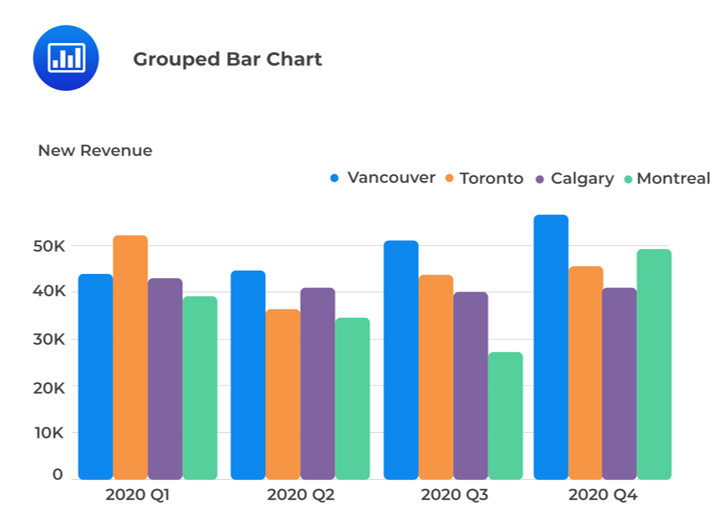
A grouped bar chart (also known as a clustered bar chart) plots two category-based variables to represent their joint frequencies.
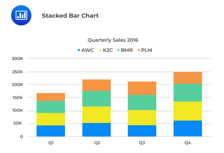
A stacked bar chart also presents the joint frequency distribution of two category-based variables. In a vertically stacked bar chart, the bars representing the sub-groups are placed on top of each other to form a single bar. Each sub-section of the bar is shown in a different color to represent the contribution of each sub-group. Further, the stacked bar’s overall height represents the category’s marginal frequency.
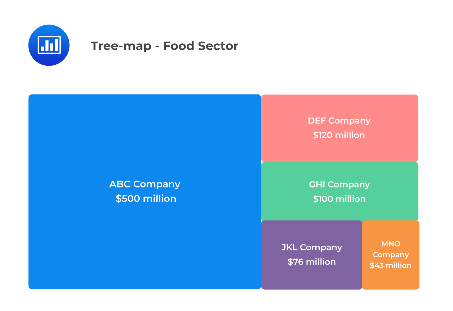
A tree-map chart displays hierarchical data. A rectangular shape represents each item on a tree-map. It is critical to note that smaller rectangles represent the sub-groups. Further, there is a correlation between the color and size of rectangles and the tree structure. Equally worth noting is the fact that the area of each rectangle is proportional to the value of the corresponding group.
The tree-map below depicts the revenues of different companies in the food sector. We can observe that ABC Company has the highest revenue in the sector, represented by the rectangle with the largest area.
A word cloud (also known as a tag cloud) is a visual representation of textual data. The size of each specific word is proportional to the frequency of words within a given body of text. We can use a different colors to convey different sentiments. For example, we can use green color to display profit. On the other hand, we can use red color to symbolize loss. A word cloud is generally used to display unstructured data.

A line chart is used to display the change in data series over time. It’s important to note that both the frequency polygons and the cumulative frequency distribution charts are line charts, representing data frequency distributions. However, they do not display the change in data over time.
In a line chart, the x-axis represents the period (say years), while the y-axis represents the data we want to plot (say, the real GDP growth rate).
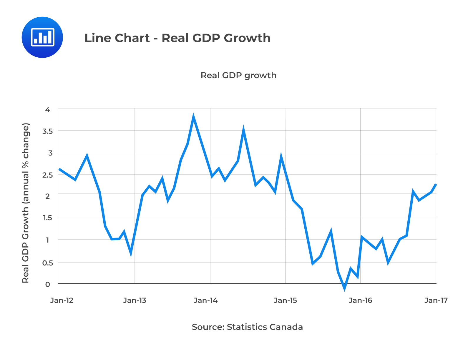
A line chart can be drawn using more than one set of data points, which can be used for comparisons.
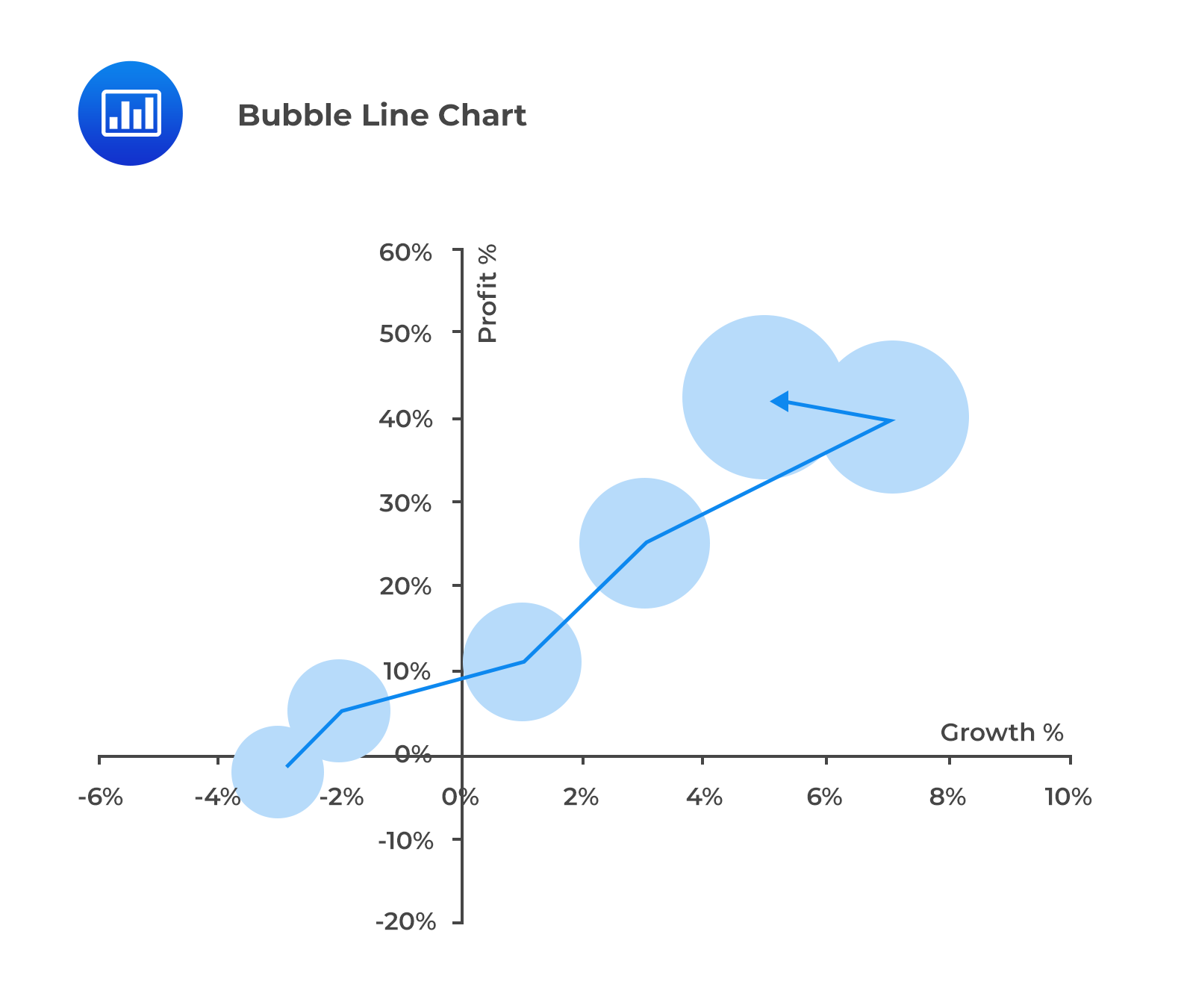
In a bubble line chart, data points are represented by bubbles of various sizes. The bubbles represent the third dimension of data. These bubbles can be of different colors to represent additional information, i.e., red bubbles for negative values and green bubbles for positive values.
A scatter plot is a graph that shows the relationship between two numerical variables. It helps in displaying and understanding potential relationships between two variables. In a scatter plot, one variable is plotted on the x-axis and another, on the y-axis.
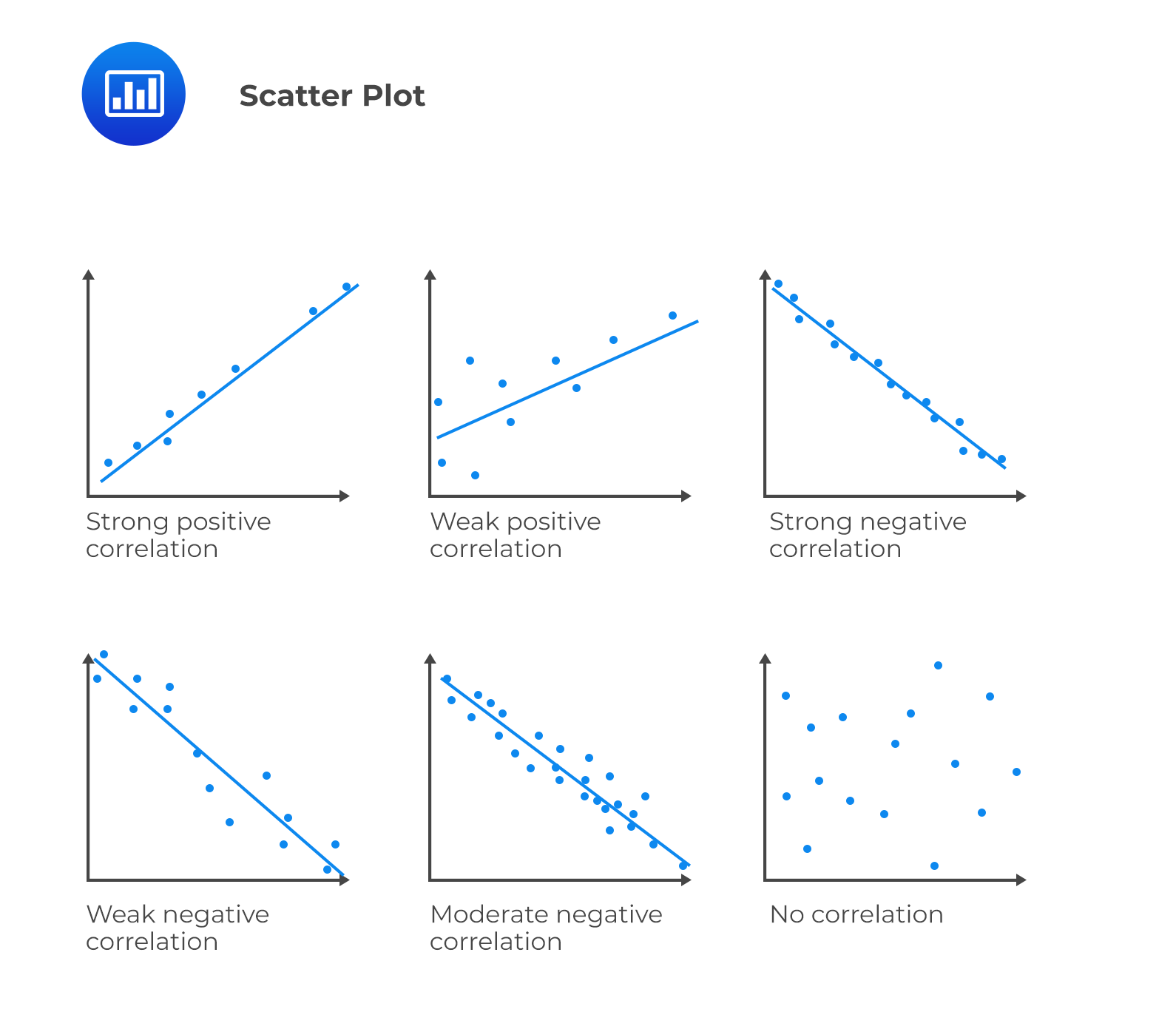
As shown above, a positive slope for a line of data points indicates a positive relationship between two variables, and vice-versa. The strength of the relationship between variables can be determined based on how closely the data points are clustered around the line. Tight clustering indicates a potentially stronger relationship. Further, data points located toward the ends of each axis represent the maximum or minimum values (i.e., outliers).
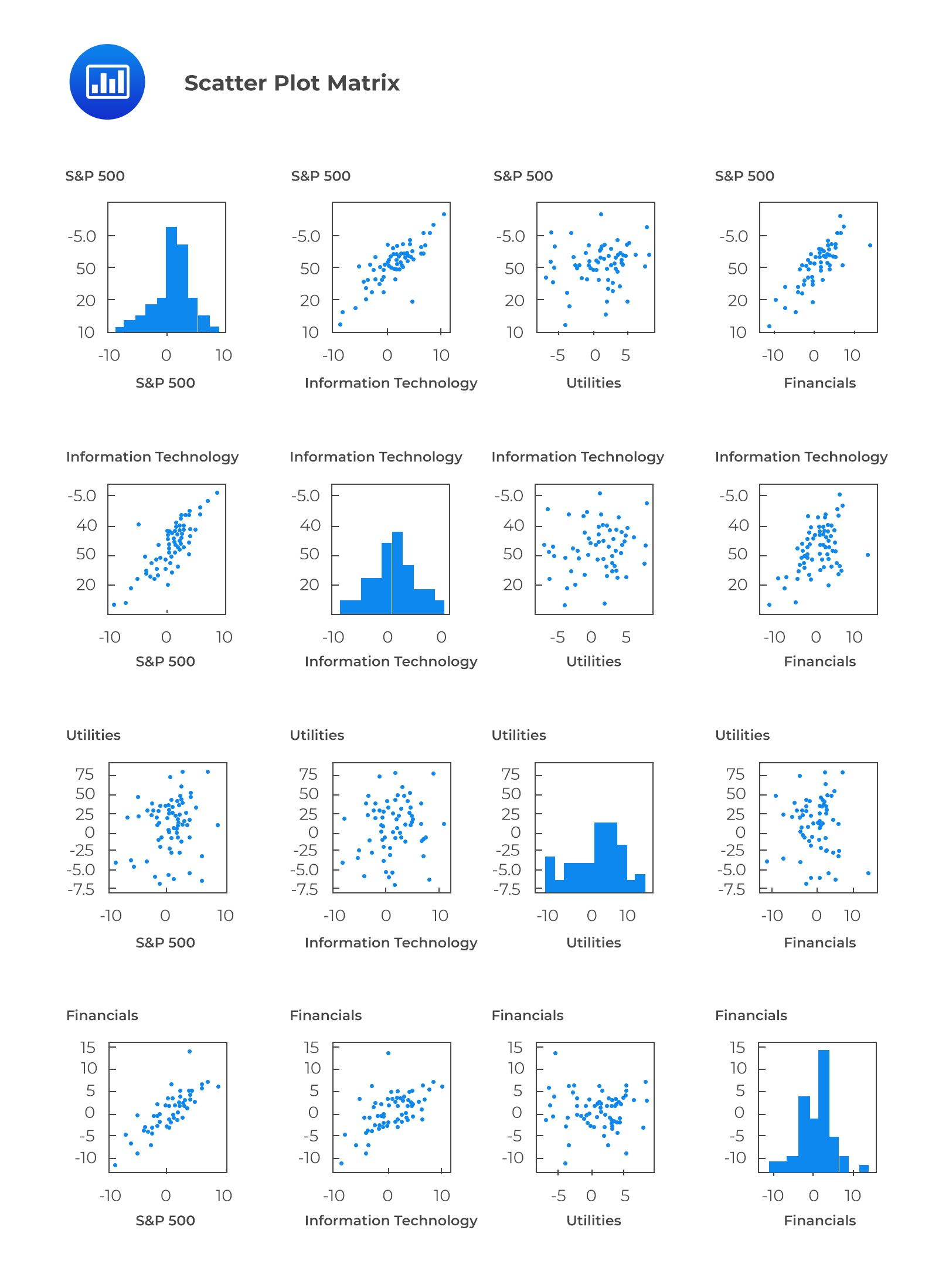
A scatter plot matrix is a grid of scatter plots used to visualize bivariate relationships between combinations of variables.
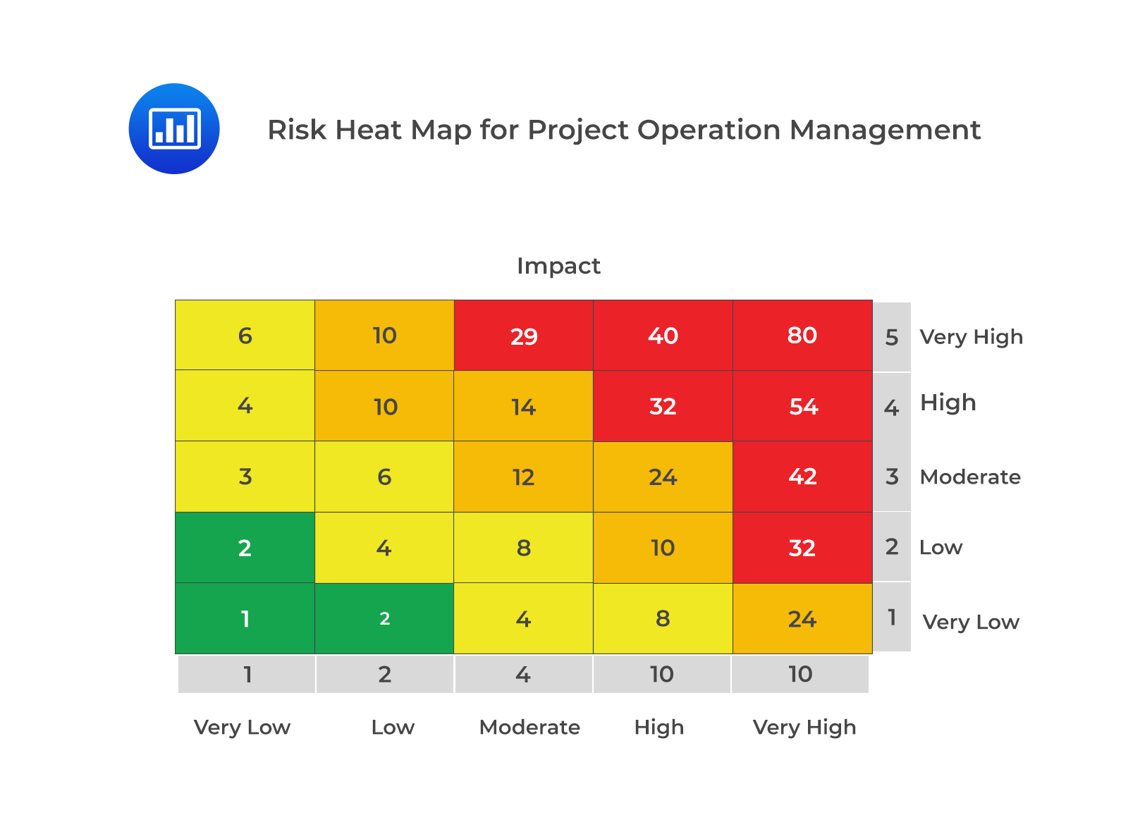
A heat map is a graphical representation of data that uses a system of color-coding to represent different values. More intense color is displayed as the marks “heat up” due to their higher values or density of records. Heat maps can display frequency distributions and visualize the degree of correlation among different variables.
Question
Which of the following most likely represents the graph drawn by connecting successive mid-points in a histogram by straight lines?
- Histogram.
- Frequency curve.
- Frequency polygon.
Solution
The correct answer is C.
When straight lines connect successive midpoints in a histogram, the graph is called a frequency polygon.
A is incorrect. A histogram is a graphical representation of the data contained in the frequency distribution but not using mid-points. Instead, a rectangle should be erected over the whole interval.
B is incorrect. When a frequency polygon is smoothed, a frequency curve is obtained.


Get Ahead on Your Study Prep This Cyber Monday! Save 35% on all CFA® and FRM® Unlimited Packages. Use code CYBERMONDAY at checkout. Offer ends Dec 1st.