


Technical Analysis (TA)
Technical analysis is the practice of using price and volume data to value... Read More

Technical analysis charts are graphical displays that show asset price and trade volume data. Charts provide technicians with information about past price fluctuations. We can use such data to predict future performance. There are different types of charts used in technical analysis. The choice is influenced by the use to which the results of an analysis will be put. The following are the major types of technical analysis charts:
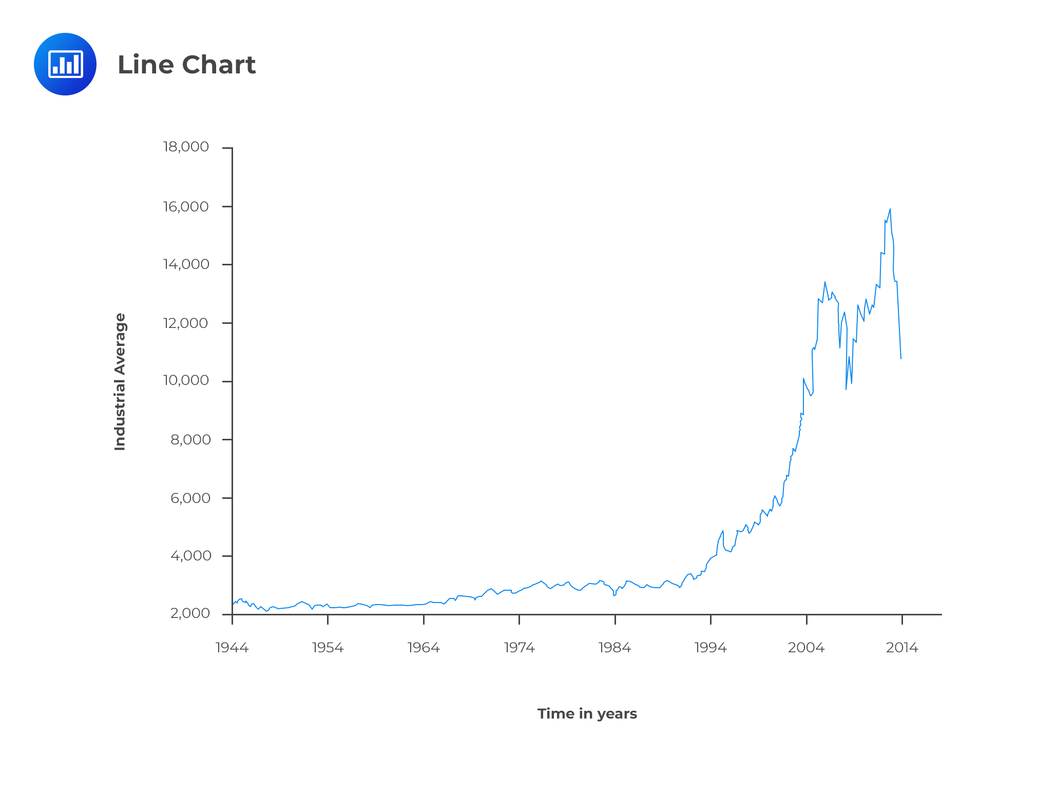
Line charts are the most popular charts among analysts because of their visual appeal. These charts show the price trends exhibited over a period of time. In these charts, a line connects plotted data points, such as stock prices. On the vertical axis, we usually have the price level whereas the horizontal axis represents time. The data points are usually the closing prices. The scale can either be linear or logarithmic, with the choice between the two types determined by the range of data. For example, a logarithmic scale would be the best choice for data with a magnitude of 100 to 100,000. Narrower price ranges, say $30 to $150, can use a linear scale.
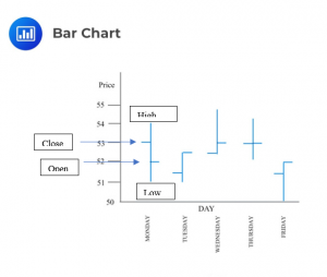
A bar chart differs from a line chart because each entry has four bits of data as opposed to just one. The four bits comprise the opening price, closing price, the high price, and the low price encountered during the time interval. Each entry usually represents a single day or month.
A vertical line connects the high price and the low price. A crosshatch to the left represents the opening price, while a similar one to the right indicates the closing price. The length of the bar indicates the divergence between the high and low prices, which increases as the divergence increases.
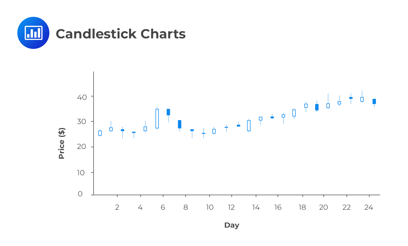
Like bar charts, candlestick charts have four bits of data per entry – the opening price, closing price, high price, and the low price. A similar vertical line called the wick shows the divergence between the high and low prices in a given time period. A shaded candle represents entries in which the closing price is lower than the opening price. A clear candle, on the other hand, shows entries in which the closing price is higher than the opening price. A candlestick chart is easier to analyze than a bar chart and shows the relationship between the highs and the lows clearly.
For price data related to short-term trading, it is preferred to use either bar or candlestick charts.
Volume plays a key role when making trading decisions. It’s common to find volume charts below many charts. The volume helps to assess the conviction of buyers and sellers when determining the price of a security.
If a price increase coincides with an increase in volume, analysts consider such a scenario as being very positive technical development. It goes to show the strength and conviction of the market in relation to a given financial instrument.
On the contrary, if a price increase is accompanied by dwindling volume, it means fewer and fewer buyers are willing to trade in that particular instrument. If the volume continues to decline, the price increase eventually stops, reflecting the reduced demand for the security.
Question
Which of the following technical analysis charts most likely shows the price trend over an extended period of time by a line plotted over data points?
- Line charts.
- Bar charts.
- Candlestick charts.
Solution
The correct answer is A.
A line chart shows the price trend over an extended period of time by a line plotted over data points.
B is incorrect. A bar chart differs from a line chart in that each entry has four bits of data as opposed to just one. The four bits comprise the opening price, closing price, the high price, and the low price encountered during the time interval.
C is incorrect. Just like bar charts, candlestick charts have four bits of data per entry – the opening price, closing price, high price, and the low price.
Access AnalystPrep’s free trial to solve CFA-style technical analysis questions, strengthen your understanding of chart patterns and indicators, and build exam-ready confidence.


Get Ahead on Your Study Prep This Cyber Monday! Save 35% on all CFA® and FRM® Unlimited Packages. Use code CYBERMONDAY at checkout. Offer ends Dec 1st.