


Defining Risk Management
Risk is generally defined as exposure to uncertainty, such as uncertain environmental variables... Read More

Technical analysis charts are graphical displays that show asset price and trade volume data. Charts provide technicians with information about past price fluctuations. We can use such data to predict future market performance. There are different types of charts used in technical analysis. The choice is influenced by the use to which results of the analysis will be put. The following are the major types of technical analysis charts:
Practice technical analysis questions free.
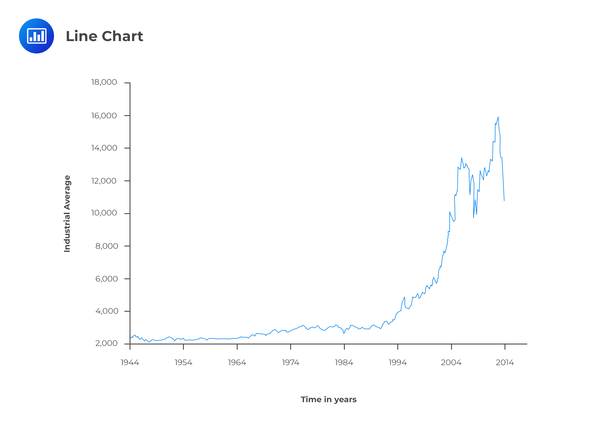
Line charts are popular among analysts because of their visual appeal. These charts show the price trends exhibited over a period of time. A line connects plotted data points, such as stock prices. On the vertical axis, we usually have the price level. The horizontal axis represents time. The data points are usually the closing prices. The scale can either be linear or logarithmic. The choice between the two types of scales is informed by the range of data. For example, a logarithmic scale would be the best choice for data with a magnitude range of 100 to 100,000. Narrower price ranges, say $30 to $150, can use a linear scale.
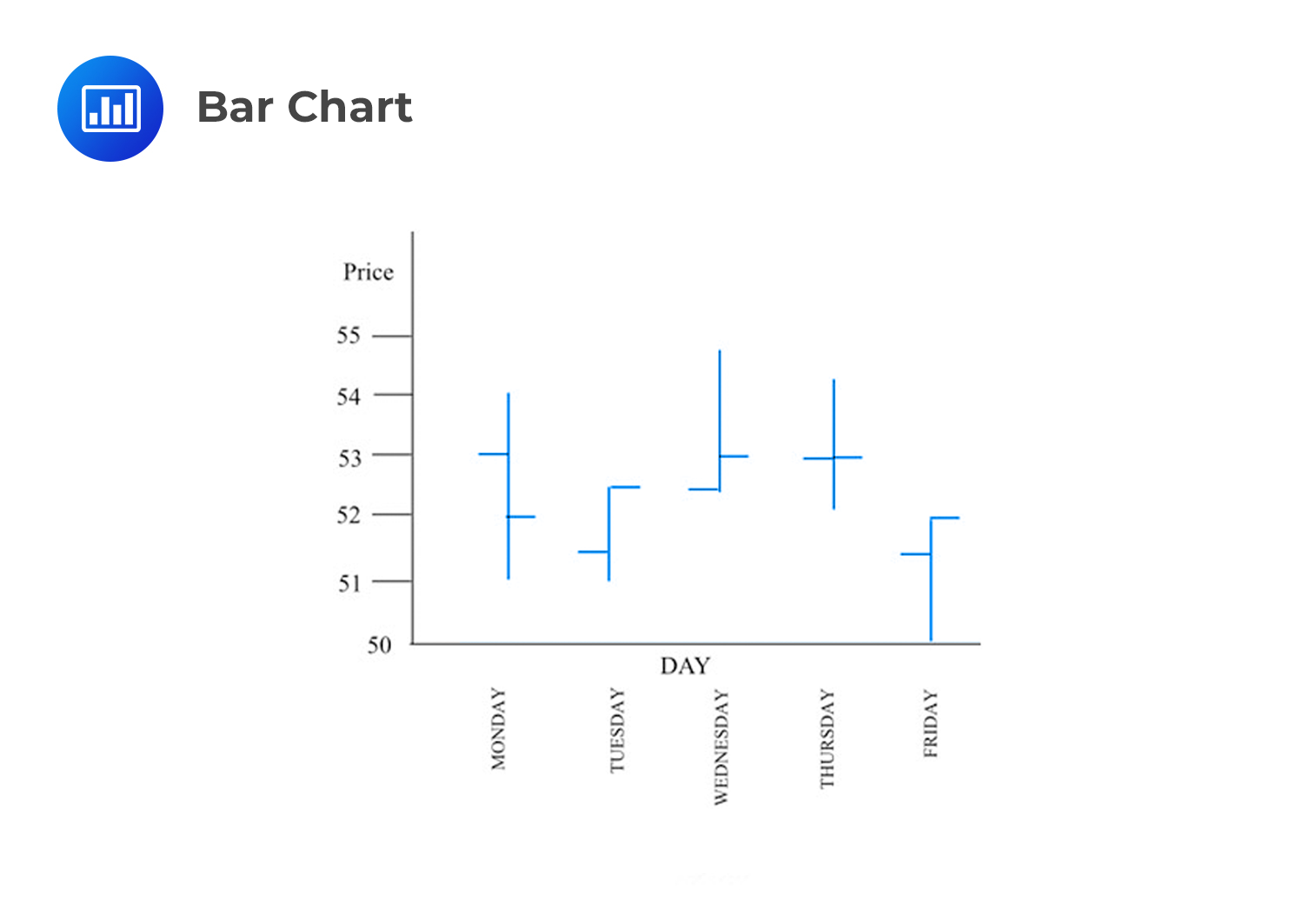
A bar chart differs from a line chart in that each entry has four bits of data as opposed to just one. The four bits comprise the opening price, closing price, the high price and the low price encountered during the time interval. Each entry usually represents a single day or month.
A vertical line connects the high price to the low price. A cross-hatch to the left represents the opening price while a similar one to the right indicates the closing price. The length of the bar indicates the divergence between the high and low price, which increases as the divergence increases.
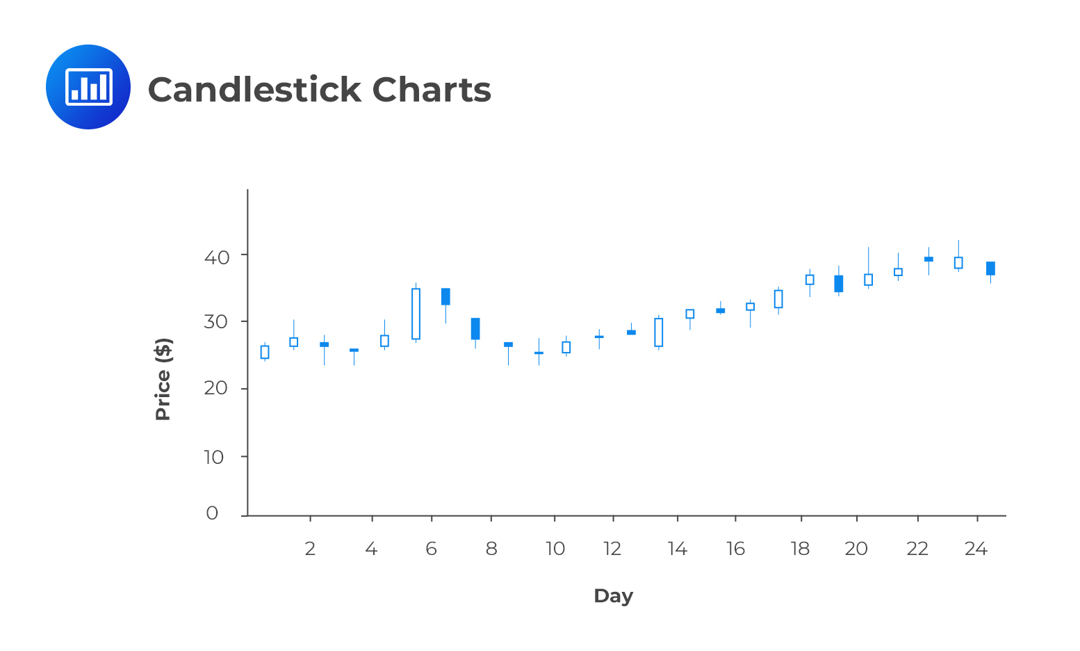
Just like bar charts, candlestick charts have four bits of data per entry – the opening price, closing price, high price and the low price. A similar vertical line called the wick shows the divergence between the high and low price within a given period. A shaded candle represents entries in which the closing price is lower than the opening price while a clear candle shows entries in which the closing price is higher than the opening price. A candlestick chart is easier to analyze compared to the bar chart. It shows the relationship between the highs and the lows very clearly.
Drawn on a grid, a point and a figure chart consists of columns of O’s alternating with columns of X’s. It isquite different from other types of charts since neither volume nor time is represented. The horizontal axis shows the number of changes in price. However, movement along the axis indicates the passage of time, albeit, irregularly.
A point and figure chart is constructed by first determining the box size and the reversal size. The box size indicates a price change revealed by the height of each box. To determine when to create a new column, the analyst uses the reversal size. The reversal is up to 3 times larger than the box size.
The starting point is the opening price. If the closing price changes by at least the box size, the analyst fills in a box in the first column. An X shows an increase equivalent to one box size while an O shows a decrease of a similar size. A double increase in price relative to the box size results in the drawing of two X’s to fill in two boxes. The second box appears on top of the first one. The analyst fills more boxes as the price moves higher. As a result, the column starts at the opening price and ends at the closing price. In case the price changes by a margin less than the box size, the analyst does not indicate anything. This is why the chart can remain without an update for a long period.
Following a reversal, the analyst shifts to a new column and begins a column of O’s. The first box to the right and directly below the highest X is filled first. An O is used to bring the column down to the price level at the close. As long as the decrease continues, the technician adds more and more O’s to the column, sitting below those drawn before. Only an increase that at least matches the reversal size prompts the start of a new column of X’s.
A point and figure chart is very useful when making trading decisions because of its ability to clearly show price levels, sharp changes, as well as small ones that are not so significant.
Volume plays a key role when making trading decisions. It’s common to find volume charts below many charts. The volume helps to assess the conviction of buyers and sellers when determining the price of a security.
If an increase in price coincides with an increase in volume, analysts consider such a scenario as a very positive technical development. It goes to show the strength and conviction of the market in relation to a given financial instrument.
On the contrary, if the price increase is accompanied by dwindling volume, it means fewer and fewer buyers are willing to trade in that particular instrument. If the volume continues to decline, the increase in price eventually stops, reflecting the reduced demand for the security.
Reading 56 LOS 56b:
Describe the construction of different types of technical analysis charts and interpret them.


Get Ahead on Your Study Prep This Cyber Monday! Save 35% on all CFA® and FRM® Unlimited Packages. Use code CYBERMONDAY at checkout. Offer ends Dec 1st.